


TradingView charts
Exercise precision on powerful trading charts
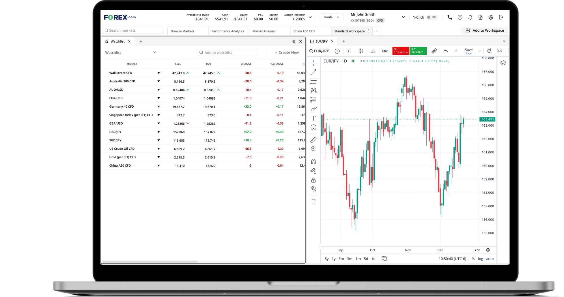
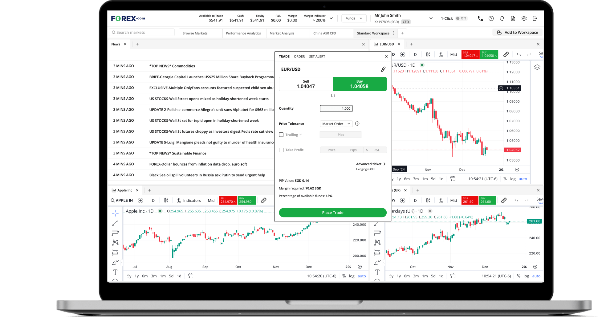
Deal through charts
Trade directly from charts. Your positions, stops and limit orders are displayed on the chart and can be amended by dragging and dropping.
80+ technical indicators
Identify trends and trading opportunities through technical analysis with an extensive selection of over 80 indicators.
Identify opportunities
14 timeframes
Determine key entry, take profit and stop loss levels by viewing markets in 14 timeframes, from one-minute to daily and monthly charts.
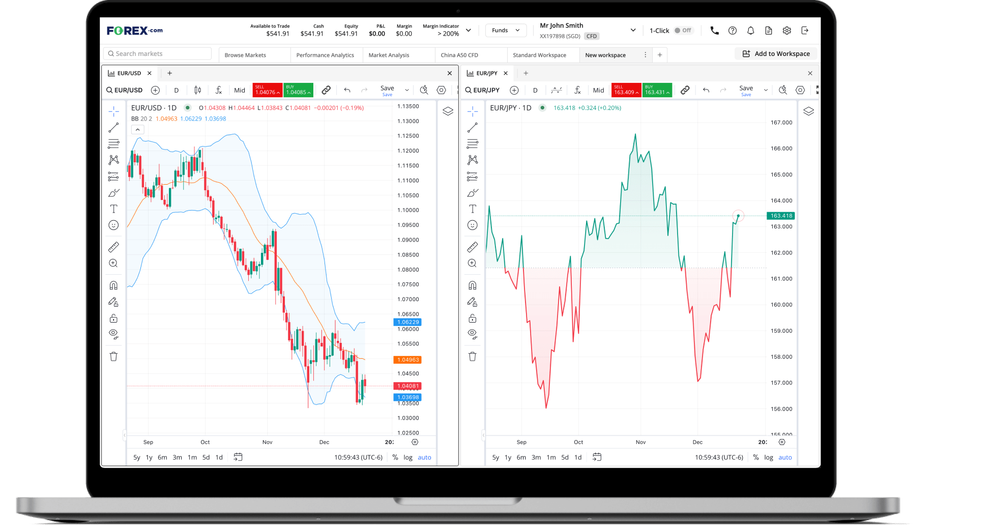
Multiple chart types
Benefit from multiple chart types, including Candlestick, Heikin-Ashi and Point & Figure to allow you to identify trends and significant price levels.
Compare markets
Add multiple markets to a single chart to analyse performance and spot new trades at a glance.
Customisable trading charts to suit your style
Extensive drawing tools
Use our extensive range of drawing tools including trend lines and Fibonacci retracements to identify key support and resistance levels.
Adapt your platform
Customise your charts with a variety of custom indicators, alerts and display options.
Frequently asked questions
How do you read trading charts?
A trading chart has two axes: the horizontal x axis, which indicates time, and the vertical y axis which indicates price. So at a glance, you can see a market’s price history for the duration of the chart. However, there are different types of chart that display this price history in different ways.
Each will break down trading activity into individual periods – which could be as short as a minute, or as long as month. The simplest chart type, a line chart, will tell you the market’s price at the close of each of these periods. You’ll get a broad idea of movement, but you won’t know what happened within a specific period.
The most popular type of chart is a candlestick chart, which uses ‘candlesticks’ to tell you the market’s high, low, open and closing prices within the period.

A candlestick has two parts. The first is a solid body that’s either red (if the market fell during the period) or green (if it rose) – this tells you the period’s open and close prices. The second is a thin line coming out of the top and bottom of the body. This is called the wick, and tells you the market’s highest and lowest points in the period.
Learn more about how to read charts.
If you have more questions visit the FAQ section or start a chat with our support.